
last updated: September 21, 2004
10:20 PM EST
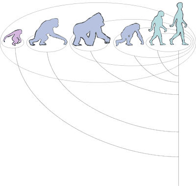
Genetic Distance Grouping with family tree, version 2
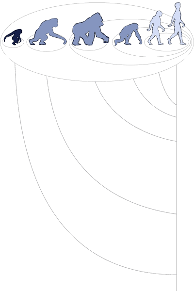
Genetic Distance Grouping with family tree, version 3
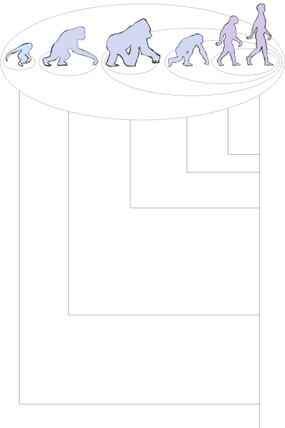
Genetic Distance Grouping with family tree, version 4
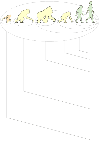
Closeup of the australopithicus
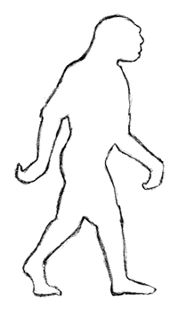
Hey there, Kris! Okay, this time I've combined the diagrams as we discussed, so that the circles reflect the genetic distance grouping, the colors reflect the traditional grouping, and the family tree is also included. I've also redone the extinct human as an australopithicus, based on the references you sent along last week (a close-up of him appears at the bottom of the page). To the left, you'll see 4 versions of the colors and family tree arrangements.
For the first version I stuck with the curved family tree and tried to make it more compact, so that the entire illustration would take up less real estate on the page. However, I found that the family tree lines couldn't stop at the circles, because you couldn't tell which line went to which animal! So they go all the way to the nearest circle, rather than stopping early. I'm not sure this makes the information as clear as it could be.
So then I tried the same kind of diagram, but stretched out so that you can clearly see where the lines are going, even if they stop at the circles. Unfortunately, I couldn't find a good way to make the curves look similar while still keeping the right relative distance between them on the timeline, so it doesn't look very symmetrical.
The third diagram was using straight lines for the family tree, to make that information stand apart visually from what the circles and the colors are trying to convey. I think it looks better, but not quite as good as...
...the final version, with a nicer sort of angled line! I also like this color combination best, of the four of them. But please consider the colors and the family tree variants "mix and match"...we can pick the one of each that you like best, whether or not they appear in the same sketch here.
Let me know what you think!
Back to Main
Back to Sketches, Round 1
On to Sketches, Round 3
On to Color Comps
On to Color Comps, Heatmap and Family Tree
On to Color Comps Round 2, Family Tree
On to Final, Heatmap